If your content gets clicks but not customers, you don’t have a traffic problem. You have a planning problem. The fix isn’t more posts or louder ads. It’s content planning and conversion optimization working together so every page knows its job, answers intent fast, and guides the next action without friction. Human first. Numbers-backed. Calm to run.
Let’s map a plan you can ship this month. Not a 60 page deck. A rhythm.
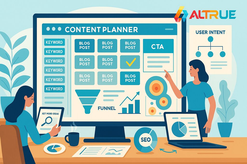
Why content planning and conversion optimization belong together
Great content that ignores conversions is a diary. Great CRO without intent fit is a bandage. Pair content planning and conversion optimization and three things happen quickly:
- Search intent meets page intent so visitors feel understood in the first scroll.
- Signals guide creative not hunches. Copy, design, and offers line up with actual jobs to be done.
- Budgets behave because you invest in pages that pull their weight.
You’ll feel it in quieter support threads and better leads. Also in your pulse. It slows a little.
Find signal fast: audience research and search intent mapping
Skip the guessy brainstorm. Do this instead.
- Interview five to eight recent buyers short calls. Ask what triggered the search, what almost stopped them, and what finally convinced them.
- Mine your own data CRM notes, chat logs, win loss reasons. Look for repeated phrases. Those become headlines.
- Map search intent informational, comparison, transactional. Build to the intent people actually have.
- List objections and pair them with proof price, time to value, trust. Each gets a quote, stat, demo, or guarantee.
- Prioritize long tail queries real problems, specific contexts. Less noise. More action.
Small inputs. Big clarity. You’ll write faster because you know who you are talking to.
Build a content architecture that sells
Random posts don’t compound. Architect your content so authority flows and decisions get easier.
- Topic clusters with clear hubs one decisive hub, supporting guides that answer related questions, and internal links that read like directions.
- Comparison and alternatives pages honest, skimmable, respected by searchers who are almost ready.
- Solution pages that tie problems to outcomes in three clean steps.
- Utilities people save calculators, checklists, templates that earn links and return visits.
A quick map you can reuse:
| Funnel stage | Page type | Primary job | Proof to include |
|---|---|---|---|
| Awareness | How to guides, explainer articles | Teach and qualify | Tiny stat, one outcome example |
| Consideration | Comparison hubs, alternatives pages | Help decide | Decision table, quote, sample |
| Conversion | Solution and pricing pages, landing pages | Remove friction and close | Guarantees, FAQs, short form |
| Loyalty | Onboarding guides, playbooks | First success quickly | Mini tutorial, milestones |
Two pages per stage beats twenty scattered posts. Every time.
Page patterns that turn visitors into buyers
Stop making readers hunt. Give them a page that thinks for them.
- Above the fold promise outcome first, under eight words, one CTA.
- Credibility slice first screen or two. Logos, tiny stat, quick quote.
- Three point benefits tied to outcomes, not features.
- How it works in three steps with short captions.
- Decision table when choices exist. Honest, skimmable, bookmarkable.
- Risk reducer free trial, audit, sample, or clear refund.
- FAQ anchored to objections heard in interviews.
Keep the copy human. Microcopy even more so. Buttons use verbs. Errors explain like a teammate.
Conversion copy and micro moments that nudge action
People convert when they feel seen and safe.
- Outcome first headlines speak to the job to be done.
- Subheads that clarify how one sentence, zero fluff.
- CTAs that promise a result Start free, See pricing, Get the audit.
- Proof near doubt place quotes or stats exactly where hesitation happens.
- Helpful errors and empty states show what went wrong and what to try.
- Tiny timing cues delivery windows, calendar slots, or demo length.
And yes, design helps. Reserve space for media so the layout never jumps as a user reaches for a button.
Measurement that changes decisions, not just dashboards
If a metric won’t change your next sprint, it’s decor. Keep a tight scoreboard:
- North star tied to revenue or qualified leads.
- Activation checkpoints first successful task, trial milestone, or booked call.
- Engaged sessions on target pages, not just entrances.
- First click success do visitors hit the intended action first.
- Scroll to decision element table, calculator, or CTA.
- Field speed metrics because slow pages erase interest.
If two move in the right direction, keep going. If not, change the page, not the narrative.
Test smarter with a ladder you can climb fast
You do not need ten tests at once. You need order.
- Proposition which promise wins.
- Offer free trial, audit, sample, or guarantee.
- Format video vs static, long vs short.
- CTA framing Get started vs See pricing vs Book a call.
- Layout hero placement, table style, proof position.
Run on one audience slice or region first. If it wins, scale. If it’s flat, retire fast. Notes in two lines. That’s it.
Editorial rhythms and workflow your team can keep
Consistency beats bursts.
- One page brief audience, job to be done, objections, proof, and the single action we want.
- Search outline H2s and H3s that mirror intent, with a place for the decision table.
- Production kit templates, image ratios, and export presets so files behave.
- Review path one content owner, one editor, one subject matter check. Done.
- Weekly cadence publish the high intent page first, then the supporting piece, then the utility.
- Monthly cleanup internal links, stale claims, slow media.
Write decisions in plain language. Future you will thank you.
Table: quick fixes that often beat another blog post
| Symptom you see | Root cause | First fix to ship |
|---|---|---|
| High entrance, low action | Promise mismatched to intent | Rewrite headline to the outcome, add decision table |
| Scrolls drop mid page | Bloated copy or missing summary | Add TLDR and anchors, tighten the middle |
| Clicks but no submits | Form friction or fear | Fewer fields, social proof near the form, friendly errors |
| Rankings wobble | Weak internal links and slow mobile | Add hub links, reserve media space, compress assets |
| Time on page high, return low | No next step path | Add related links that move to compare or try |
Touch two rows this month and you’ll feel the lift next month.
Content SEO details that quietly compound
Small things, big results.
- Semantic headings mirror how users think.
- Structured data on pages where it adds meaning FAQ, product, how to, organization.
- Internal links with descriptive anchors teach both humans and crawlers what lives where.
- Sitemaps and canonicals tidy and honest.
- Field speed first content in a couple of seconds on typical mobile.
No magic. Just craft.
H3: What is content planning and conversion optimization
It’s the paired practice of deciding what to publish based on real audience needs and search intent, then shaping each page to guide a clear next step. The goal is simple. Rank for the right reasons and turn interest into action.
H3: How long until content planning and conversion optimization pays off
High intent improvements land in a few cycles. Clarity on landing pages, better internal links, and proof near doubt usually move early. Larger content clusters and authority lifts compound over quarters. Not overnight. Not glacial either.
Sample eight week roadmap you can actually keep
Weeks 1 to 2
Interviews, objection map, pick three battleground pages. Draft outlines with decision tables and proof placements.
Weeks 3 to 4
Publish the first two high intent pages. Add internal links from five relevant posts to each. Speed pass on those templates.
Weeks 5 to 6
Build one comparison hub and one utility asset. Add structured data where it helps. Start a proposition test on a single audience slice.
Weeks 7 to 8
Refresh retargeting with outcomes and proof. Tune forms. Close the loop with an email nudge to the utility asset. Document wins and pick the next obvious move.
Feels calm. Works hard.
The human side of pages that convert
This work respects people. Your readers, who want answers without a maze. Your team, who deserve fewer fire drills and more small wins. And you, because watching a stranger read a line and think finally, that’s me then click the button never gets old. When the right page climbs and the form feels easy, that quiet yes is your return. You already know the rest.
Ready to pair content planning and conversion optimization so your site wins the click and the action. Let’s map your first three pages and ship. If you want that calm lift, contact us and we’ll build the plan together.