A forgettable brand costs more than you think. People skim. Scroll. Decide in seconds. If your logo wobbles or your layouts feel like a puzzle, trust slips and clicks wander. The fix isn’t a mood board dumped into a template. It’s brand logo and layout graphic design built on clear rules, smart choices, and the kind of craft that looks effortless on the surface. You get recognition, recall, and results. In that order.
You don’t need louder colors or trend-of-the-month fonts. You need a system that makes every asset look obviously you. Calm, consistent, unmistakable.
Why brand logo and layout graphic design builds trust
A brand is a promise. Your logo and layout design are how that promise shows up on a home page, a product sheet, a story post, even a tiny favicon. Done right, they:
- Create instant recognition so users know they’re in the right place
- Guide attention with hierarchy that shows what matters first
- Reduce friction because spacing, type, and color do the heavy lifting
- Scale cleanly from mobile banners to storefront signage without rework
Trust isn’t just messaging. It’s the feeling that every touchpoint came from the same thoughtful mind. That’s design doing its job.
From scattered assets to a dependable visual system
If your files are named final_v7_reallyfinal.ai, you’re not alone. But let’s get you out of there.
- Audit and alignment
We review current marks, colors, type, and real-world use. What’s working. What’s drifting. What needs a clean start. - Identity core
Primary logo, secondary marks, wordmark, and icon set. Each sized for the places you actually live: site header, app tile, social, print. - Layout grammar
Grids, columns, spacing tokens, and headline-to-body ratios. These rules make every page feel familiar without being repetitive. - Color logic
Brand palette plus accessible pairings. Tints, shades, and interaction states that hold up on bright phones and dim laptops. - Type stack
Headings, body, code, and UI labels with legible sizes and line heights. Think “looks great” meets “reads easy”.
You’ll go from chasing consistency to getting it by default. Feels good.
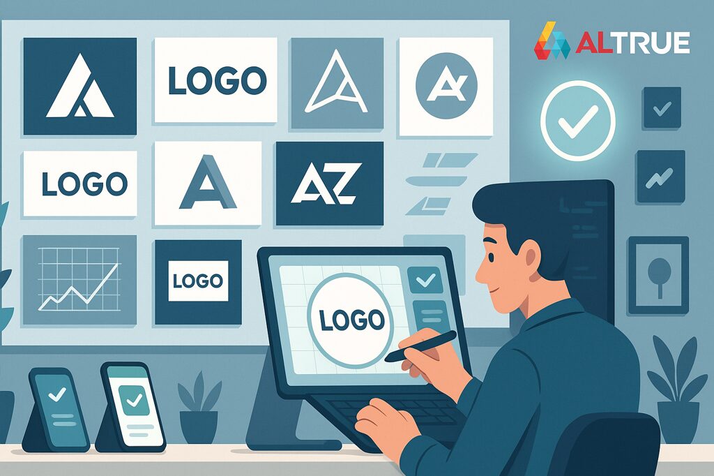
Logo design that feels inevitable (not overworked)
The best logos don’t beg for attention. They earn it. Quietly.
- Concepts that tie to your story, not just shapes that look cool this week
- Simple geometry that scales down to 16 px without losing the idea
- One-color strength so it survives receipts, stamps, and budget print
- Locked spacing that protects clarity in crowded headers
- Responsive marks: primary, stacked, icon-only variants that all feel like family
If your logo needs special effects to read, the mark isn’t ready. We make it ready.
Table: logo variants and where they shine
| Variant | Where it wins | Why it works |
|---|---|---|
| Primary horizontal | Website headers, documents | Reads fast, anchors navigation |
| Stacked | Social profiles, square containers | Balanced footprint, strong presence |
| Icon-only | Favicons, app tiles, watermarks | Recognizable at tiny sizes |
| Monochrome | Print, stamps, embroidery | Eliminates color-dependence |
Layout design that moves eyes and clicks
Layouts are your brand’s body language. They tell eyes where to go next and hands what to do.
- Clear hierarchy
One job per screen. Headlines that lead. Subheads that guide. Body that breathes. - Grid that earns its keep
A baseline grid locks spacing while letting content flex. Cards, lists, hero sections—everything snaps into line. - Whitespace with purpose
Not empty. Intentional. It makes messages land and buttons feel tappable. - CTA ergonomics
Buttons that look like buttons. Touch targets that respect thumbs. Labels that use verbs. (You’ll notice the lift.) - Proof blocks
Quotes, ratings, stats placed near key decisions. Short, believable, useful.
And yes, motion—used sparingly—should clarify relationships, not distract. A tiny nudge. Not a carnival.
Color, type, and spacing rules that scale without guesswork
Design chaos starts when choices multiply. A few strong rules prevent it.
- Color tokens
Brand, neutral, and feedback palettes with contrast-safe pairs. Interaction states defined upfront. - Type ramp
H1 to caption with exact sizes, line heights, and letter spacing. No mystery 23 px headings lurking in the wild. - Spacing scale
4 or 8 px step system that fits screens and grids. Margins and paddings become consistent without thinking. - Image ratios
Hero, card, avatar, thumbnail. Pre-set crops stop late-night re-exports. - Iconography
Stroke weight, corner radius, and visual weight rules so icons read as a set.
Rules aren’t there to limit creativity. They protect it. And speed up every decision.
Production files that ship cleanly the first time
Pretty comps don’t convert by themselves. Pack the files the way real teams need them.
- Master files with named layers, color styles, and typography tokens
- Export recipes for web, social, and print formats with exact naming
- Usage notes in plain language: minimum sizes, clear-space rules, what not to do
- Licensing clarity for typefaces, illustrations, and stock so you never guess
- Handoff support for dev and print, including specs they won’t have to hunt for
And we leave an audit trail. So future-you can find things in seconds, not hours.
Deliverables snapshot
| Deliverable | What you get | Why it matters |
|---|---|---|
| Logo suite | Primary, stacked, icon, mono | Covers every footprint |
| Brand guide | Colors, type, spacing, examples | One source of truth |
| Layout kit | Grids, components, templates | Faster pages, fewer revisions |
| Asset library | Icons, patterns, imagery | On-brand by default |
| Export pack | Web, social, print presets | No last-minute guessing |
Measurement: how good design changes behavior
Design earns budget when it changes what people do.
- Recognition surveys before and after a mark refresh
- Engaged sessions on key pages after layout cleanup
- First click success measuring if visitors hit the intended action first
- Form completion rate once spacing, labels, and error states get human
- Support ticket themes for confusion or “can’t find” dropping over time
If two of those move the right way, your system is working. Keep going.
What is brand logo and layout graphic design
It’s the craft of creating a recognizable mark and the rules that shape how content is arranged—on pages, screens, and print—so your brand looks and feels consistent everywhere. The outcome is practical: faster production, clearer messages, and visuals people remember.
How long does professional brand logo and layout graphic design take
Short answer: weeks for a focused refresh, a couple of cycles for a full system. We start with the most visible wins—logo suite and core layouts—then roll standards across the assets you use most. You’ll see impact early, not just at the end. Not overnight. Not glacial either.
A simple roadmap you can actually keep
- Week 1: Audit assets, gather real samples, pick goals
- Week 2: Logo concept round and color/type options with quick context
- Week 3: Lock mark, build the type and color tokens, draft grids
- Week 4: Layout kit for top pages with components and spacing rules
- Week 5: Export presets, usage notes, and developer handoff
- Week 6: Roll into social, decks, ads; tidy edge cases; publish guide
Nothing theatrical. Just steady progress your team can feel in every file they open.
Prioritize with an impact matrix
| Area | High impact, low effort | High impact, higher effort |
|---|---|---|
| Logo | Finalize icon variant and clear-space | Redraw for better legibility at tiny sizes |
| Layout | Tighten spacing, simplify hierarchy | Rebuild navigation and template grid |
| Type | Set a readable ramp and weights | Switch family and retune metrics |
| Color | Fix contrast and states | Expand palette and document system |
| Assets | Export social and email kits | Commission custom illustration set |
Ship the left column this month. Schedule the right with eyes open.
Common pitfalls to skip (yes, we’ve seen them)
- Designing thirty perfect screens before defining grids and type
- Over-relying on mockups that hide how marks behave at 16 px
- Letting color carry meaning alone and losing clarity for color-blind users
- Compressing images until they smudge (then wondering why things look cheap)
- Storing masters with exports so vendors grab the wrong file
Fix two and next month feels lighter. You’ll feel it in feedback and in your own sanity.
The human side of great brand design
This work respects people. Your audience, who decide quickly and appreciate clarity. Your team, who deserve files that behave and rules that help. And you, because seeing your brand look right—everywhere—never gets old. When a user recognizes your mark in a sea of tabs and your layout quietly guides them to yes, that’s the moment design pays off. You can almost hear it.
Ready to turn scattered assets into a system with brand logo and layout graphic design that ships fast and scales cleanly? Let’s map the first wins and build the kit your team will actually use. If you’re ready for that calm lift, Contact us and we’ll get you moving.